Background
In plant trials, it is often the case that the effect of the variable being tested is camouflaged by other variables changing uncontrollably in the process. A classic example is during reagent trials, where benefits to metal recovery (if any) are frequently overwhelmed by changes in the plant feed grade. The new reagent may very well impart a true benefit to overall metal recovery, but this will most likely be smothered out by swings in feed grade that usually also strongly drive recovery. If the experimental design does not conform to best-practice statistical criteria, then disentangling the effect of the reagent from the effect of changing feed grades can be extremely difficult, leading to uncertainties about whether the operation should implement the change.
In the late-1990s, Prof Tim Napier-Munn (then director of the JKMRC) published an approach to do this mathematically (Napier-Munn, 1998). It involves trending the process KPI (e.g. recovery) as a function of the nuisance, uncontrollable variable (e.g. feed grade). This is done separately for the baseline and trial conditions. The magnitude of the separation (i.e. the recovery benefit, in the case of a reagent trial) between the two trendlines is then calculated, and statistically assessed to determine if the benefit is real or just an artefact of ‘noise’ in the data. In this way, the effect (if any) of the trial variable is quarantined from both the uncontrollable nuisance variable and data ‘noise’, allowing metallurgists to determine whether a permanent change to the new condition is warranted. The method is taught in JKTech’s flagship statistics course, and has also been implemented in our freeware Excel application, JKToolKit.
The approach is illustrated with a case study in the following section.
Reagent Trial Case Study
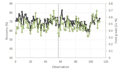 Two reagents are tested in a concentrator, one the normal reagent (n) and the other the trial reagent (t). The trial is not performed as a formalised experiment such as a paired trial (as it should be) and instead is undertaken crudely, with the reagent changed at a single point in time. Recovery (black) and feed grade (green) time trends are shown in the figure to the right, with the reagent switch indicated by the vertical reference line.
Recovery can be seen to be very noisy and strongly correlated with feed grade. Laboratory testing indicated a potential recovery improvement of 1-2% with the new reagent; if this benefit can be realised in the plant, it would be worth millions of dollars in extra metal production per year. However, it is clear when trialling in the plant that any potential benefit is being swamped out by the variability in production data. The question remains for the production team: should the operation make the switch to the new (and more expensive) reagent?
The workflow for answering this question with the Comparison of Trend Lines in JKToolKit, is described in the next section.
Inputs
 When invoking the Comparison of Trend Lines in JKToolKit, users will see an area to input two sets of X-Y data, four columns in all, which can be pasted or entered into the data columns. It is envisaged that this would often be feed grade-recovery data from a plant trial, but any X-Y data comprising an independent variable and dependent variable can be analysed in the same way using this tool. The X-variable is the nuisance, uncontrollable variable (feed grade in the instance of the current case study), and the Y-variable is the process KPI (recovery in this instance). Dataset 1 (X1-Y1) corresponds to a certain experimental condition (the trial reagent data, in this case study) while Dataset 2 (X2-Y2) corresponds to the other experimental condition (the baseline reagent data).
The data input table is shown to the right (and in this case there are many more rows of data, not shown here).
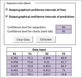
At the top of the data input area there are two check-boxes. These are to allow you to select whether or not you want the program to produce two other plots for each dataset – in addition to the main plot which will always be shown in the centre of the tool's interface area. If you check either of these boxes, the program will create a new sheet called Regression Lines at the end of the calculation process. This sheet will contain the plot or plots requested, either the fitted trendline showing the confidence intervals on the line, or the trendline showing the confidence intervals on any new prediction of the model, or both. The confidence level in each case is selected by the user in the dialogue box ‘Confidence level for charts (next tab)’. The default values are 95%; do not use values less than 90%.
The tool also calculates the confidence interval on the measured separation of the two trendlines. You must choose the confidence level for this calculation and enter it in the first box, ‘Confidence level for separation’. Again the default value is 95%.
Once you have added all the data pairs in the table for both of your data sets, and made your other selections, the ‘Calculate’ button can be pressed to generate the results.
Outputs
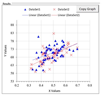 The main visual assessment of the results is provided by a scatter plot of the data with the two fitted trendlines also plotted, as shown to the right. The two datasets are identified as ‘Dataset1’ and ‘Dataset2’. In this case Y is recovery (%) and X is feed grade (%). You can re-format the chart in situ. You can also copy the chart via the ‘Copy Graph’ button provided in the top right corner, and paste into another Excel worksheet or other application, and re-format it there.
FITTED TRENDLINES STATISTICS
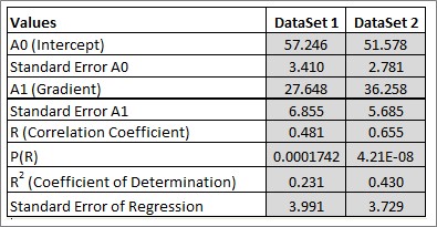
This table summarises the parameters of the two fitted trendlines (intercepts and gradients) and their uncertainties (standard errors). The linear correlation coefficient, R, measures the dependency of Y upon X, and its P-value measures its significance. As before, a P-value of ≤ 0.05 conventionally indicates that R is significant, that is, it is not zero, and therefore there is a real correlation. R2, the coefficient of determination, measures the proportion of data variation ‘explained by’ or accounted for by the fitted line (the model). It measures the goodness of fit of the model. The closer it is to 1, the better is the fit. But note that R2 will always increase as the number of data points decreases, so there is no ‘magic value’ of R2 which indicates a good fit. R2 is useful to compare similar models. The only rigorous statistical test for correlation is the P-value for R. In the example to the right both R-values are highly significant (P = 0.000 to 3 decimal places) and therefore we do have two real trendlines to compare. See Napier-Munn (2014) for further discussion of these issues.
COMPARE RESIDUAL MEAN SQUARES (SCATTER)
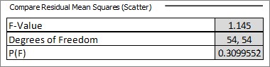
This table is the statistical test for the comparison of the two residual mean squares (the scatter around the two lines after the trendlines are fitted) using an F-test. We require that these values are similar for the two lines, so we are looking for a P > 0.05 for the F-test. In this case P = 0.31 which meets our requirement, so we can proceed with the rest of the analysis. Should P < 0.05 we can still proceed with caution but we should prefer lower P-values for the remainder of the statistical tests.
COMPARE GRADIENTS
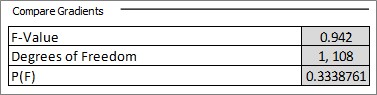
This table is the statistical test for the comparison of the two trendline gradients (slopes) using an F-test. In order to validate the comparison of the separation of the lines, discussed below, we require that the lines be statistically parallel, ie that their gradients are not significantly different, P > 0.05, as in this case. If P < 0.05 then the separation of the lines is not constant and has no meaning. However the fact that the two lines have different gradients may still be of metallurgical interest, as it implies that under one condition the effect of variable X on variable Y is greater than under the other condition.
COMPARE INTERCEPTS
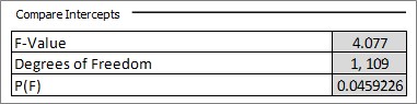
This table is the statistical test for the comparison of the two trendline intercepts using an F-test. Again a P-value < 0.05 suggests that the lines have different intercepts. Note that this test can be misleading where the intercepts occur a long way from where the data are. When comparing the separation of the lines this test is usually bypassed. However comparing intercepts can sometimes be useful in its own right, for example in comparing instrument calibration curves.
SEPARATION OF THE TRENDLINES
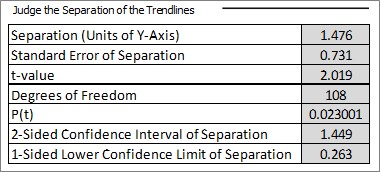 The table to the right is the statistical test for the significance of the mean separation of the two trendlines in the y-direction using a t-test, assuming that the two trendline gradients are not statistically different. P-value ≤ 0.05 (or whatever hurdle rate the user chooses) indicates that the observed separation is statistically significant (i.e. not zero). Confidence intervals on the separation are also provided, using the confidence level entered in the box in the top left area of the spreadsheet.
Conclusions
In the table above, using data from a plant trial of a new reagent, the mean separation is 1.5% recovery and this is highly significant with a P-value of 0.023. We are therefore confident that there has been an improvement in recovery, and our estimate of the quantum of improvement is 1.5%. The 95% confidence interval on this value (95% chosen by the user in the data input area as described earlier) is ± 1.4% and the lower 95% confidence limit is 0.3%. Thus we are 95% confident that the improvement in recovery with the new reagent is at least 0.3%, but our best estimate of the improvement is 1.5% ± 1.4% with 95% confidence. We are 97.7% confident that the difference is not zero (100(1-0.023)%).
JKToolKit is a freeware Excel application that provides mining professionals with streamlined access to a suite of powerful calculations, from industry-standard models to sophisticated and novel routines that are only described in the academic literature or specialised reference texts.
JKTech also offers statistics related support through courses and consulting. Please contact us if you would like us to assist you in training your team or employing statistics analysis for plant optimisation.
References
Napier‐Munn, T.J., Analysing plant trials by comparing recovery-grade regression lines. Minerals Engineering, 1998, 11(10), 949-958.
Napier-Munn, T.J., Statistical Methods for Mineral Engineers - How to Design Experiments and Analyse Data. 2014 (later versions with corrections and improvements), Julius Kruttschnitt Mineral Research Centre (University of Queensland).